RENDEZ-VOUS
Info
This project was commissioned by a client looking to select local cuvées from Provence (French wine territory) and export them to the American and Brazilian markets. The main challenge was designing for an international audience rather than a local one, playing into global perceptions of France. The project came with a dual constraint: first, to honor Provence's heritage so local winemakers would trust the brand to represent them; second, to embrace international visual codes and tropes to resonate with overseas buyers. As the client ultimately pivoted to a different market strategy, this project is no longer under NDA, allowing me to share these visuals!
Year
2025
Client
NDA
Services
Branding + Visual Identity
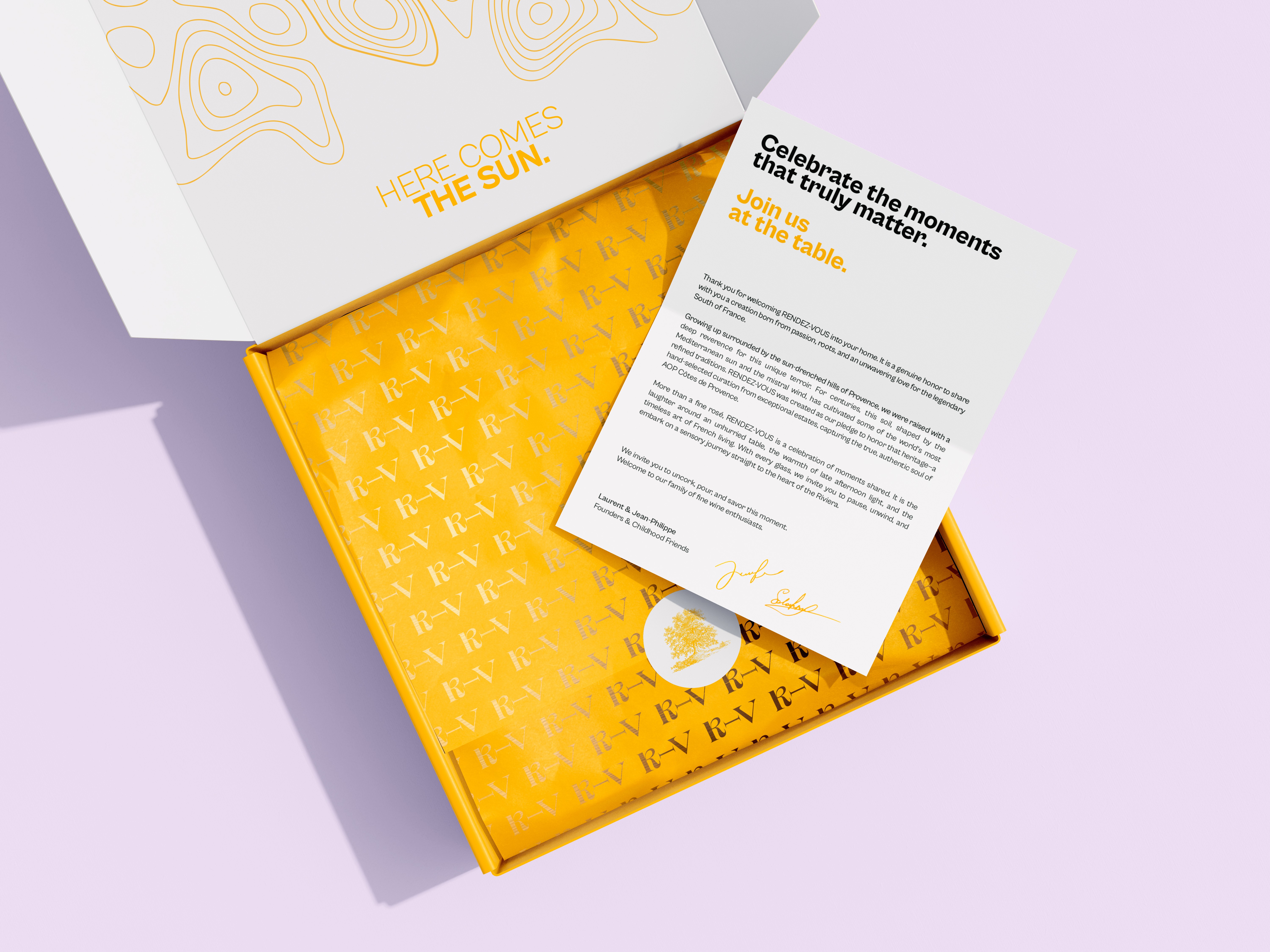


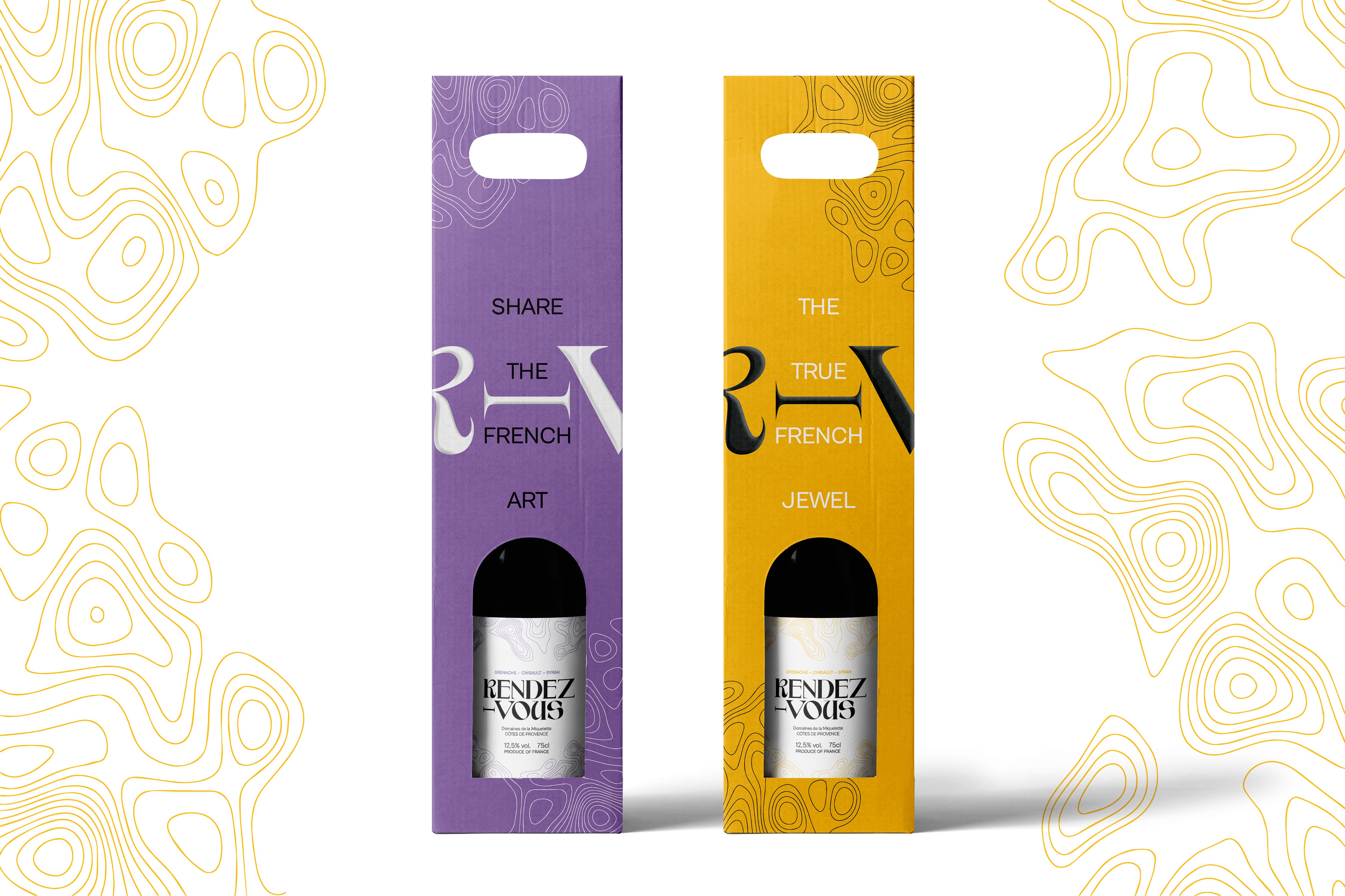
Operating in an early-stage research phase, I explored multiple visual variations grounded in a core design system (colors, type, logo, and patterns). This gave the client a versatile palette to rapidly generate marketing collateral for key stakeholder meetings. Rather than relying on overt regional clichés like olives, suns, or lavender, I grounded the identity in Provence’s physical territory through a topographic matrix, letting a refined color spectrum subtly carry the regional heritage.